Building my own RAG visualiser

I Fed My Blog to a Vector Database and Asked It Questions About Me
I spend most of my days thinking about teams, delivery, and strategy. But every now and then I get an itch to close gmail, open a terminal, and just build something. The current wave of AI tooling has made that itch almost unbearable, so over a couple of spare hours I set myself a challenge: take the sixteen posts from my personal blog, feed them into a vector database, and see if I could have a conversation with my own writing.
What started as idle curiosity turned into a surprisingly satisfying little pipeline — and a genuinely interesting way to see your own content from a new angle. Here's how it works, what I learned, and why you might want to try the same thing.
What even is a vector database?
If you've used a traditional database, you're used to searching for exact matches — give me every row where `status = 'active'` or where the title contains the word "juggling". That works brilliantly when you know exactly what you're looking for.
Vector databases flip the model. Instead of storing rows and columns, they store embeddings — long lists of numbers (vectors) that represent the meaning of a piece of text. My blog posts get converted into 384-dimensional vectors by a language model, and those vectors land in a space where similar ideas sit close together. A post about managing engineering teams and a post about treating people as more than resources end up as neighbours, even though they might not share a single keyword.
The upshot: you can search by concept, not just by keyword. Ask "what does the author think about leadership?" and the database returns the most semantically relevant chunks of text, even if none of them literally contain the word "leadership."
Step 1: Chopping up the posts
Raw blog posts are too long to embed in one go — the meaning gets diluted. So the first job is chunking: splitting each markdown file into smaller pieces that each carry a coherent idea.
I wrote a simple ingestion script that splits on markdown headings and then subdivides any sections longer than about 800 characters on paragraph boundaries. Each chunk keeps metadata about which post it came from and which section heading it sat under. Sixteen posts produced 108 chunks — a manageable corpus that still covers everything from IoT adventures to my first Apple app to unsolicited opinions about cars.
Those chunks get handed to ChromaDB, an open-source vector database that runs locally with zero configuration. ChromaDB's default embedding model (all-MiniLM-L6-v2) converts each chunk into a 384-dimensional vector and stores everything in a local SQLite-backed collection using cosine similarity. The whole ingestion step takes a few seconds.
Step 2: Asking questions (the RAG bit)
This is where Retrieval-Augmented Generation comes in. RAG is one of those acronyms that sounds more intimidating than it is. The idea is simple:
- Take the user's question and embed it into the same vector space as the blog chunks.
- Find the five nearest chunks (the retrieval step).
- Hand those chunks to a large language model as context and ask it to answer the question (the generation step).
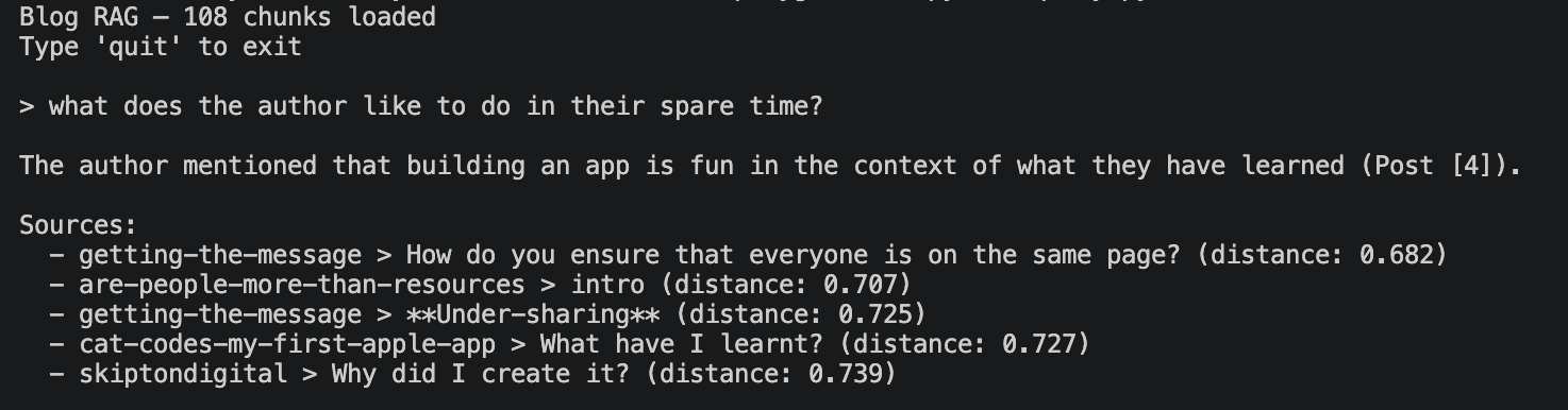
The result is an LLM that's grounded in your actual content rather than making things up from its training data. Ask it "what has the author built?" and it'll pull in chunks about Cat Codes (my first iOS app), an IoT temperature sensor project, and a .NET experimentation post — then weave them into a conversational answer with citations.
For the LLM, I'm running Gemma-4 locally through LM Studio, which exposes an OpenAI-compatible API on localhost. That means the entire pipeline — database, embeddings, and language model — runs on my machine with no API keys, no cloud costs, and no data leaving the building.
I built two interfaces for this. The first is a simple terminal REPL: type a question, get a streaming answer with source citations. It's fast, it's satisfying, and it's the kind of thing you can demo to a colleague in thirty seconds.
Step 3: Seeing the shape of your writing
The REPL was the thing I set out to build. The visualisation was the thing I didn't know I wanted.
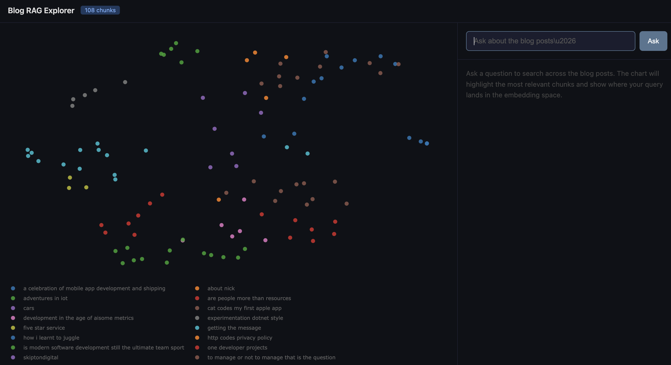
When you embed text into 384 dimensions, the spatial relationships carry real meaning — but you can't exactly plot a 384-axis scatter chart. The standard trick is dimensionality reduction: squash those hundreds of dimensions down to two while preserving as much of the neighbourhood structure as possible.
I used UMAP (Uniform Manifold Approximation and Projection) for this. UMAP is generally preferred over the older t-SNE approach because it does a better job of preserving the global relationships between clusters, not just the local ones. In practice, that means posts that are thematically related end up in the same region of the 2D plot, and the relative distances between clusters are meaningful too.
The reduced coordinates get plotted with Plotly as an interactive scatter chart. Each dot is a chunk of a blog post, coloured by which post it came from. You can hover over any point to see the source, section heading, and a snippet of the text. You can pan, zoom, and click legend entries to filter by post.
What I didn't expect was how legible the clusters would be. My management and leadership posts huddle together on one side. The technical build logs (IoT, mobile apps, .NET) form their own neighbourhood. The more personal or reflective posts sit in between, pulling slightly toward whichever theme they lean into. It's a map of your own thinking, and it's oddly compelling to explore.
The fun part: querying the map
The web app brings the REPL and the visualisation together. When you type a question, three things happen simultaneously:
1. Your query gets embedded and projected into the same UMAP space. It appears on the chart as a red star.
2. The five most relevant chunks light up in gold, with dotted lines connecting them back to your query point.
3. The LLM answer streams in on the right-hand panel, with source citations.
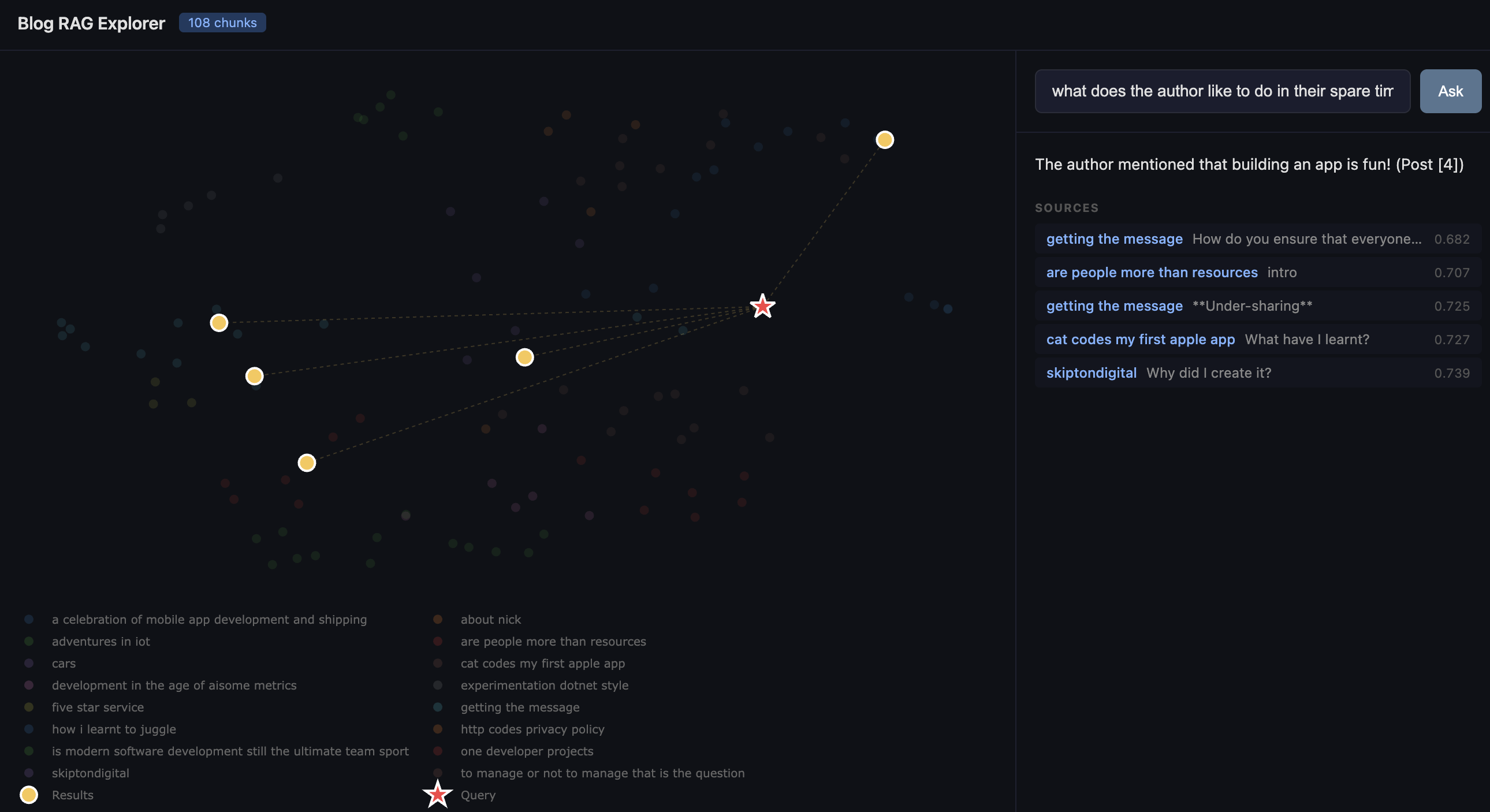
It's genuinely useful for seeing why the system retrieved what it did. If your query star lands right in the middle of the management cluster, you know it understood the intent. If it lands somewhere unexpected, you've learned something about how the embedding model interprets your question — or about unexpected connections in your own writing.
What surprised me
How little code it takes. The entire project is four Python files and a handful of dependencies. ChromaDB handles embedding, storage, and retrieval. LM Studio handles inference. Flask serves the web app. The most complex part is the chunking logic, and even that is under seventy lines. If you've been putting off playing with vector databases because it feels like a big undertaking, it really isn't.
How good small models are. I'm running Gemma locally on a MacBook. The answers are coherent, well-cited, and genuinely useful. You don't need GPT-4 and a cloud bill to build a RAG pipeline that works.
How revealing the visualisation is. I expected the UMAP plot to be a fun novelty. Instead, it became the thing I kept coming back to. There's something valuable about seeing your own body of work laid out spatially — it shows you where your themes cluster, where the gaps are, and which posts are more connected than you realised.
Try it yourself
If you've got a folder of markdown files — blog posts, meeting notes, a knowledge base, documentation — you can have this running in an afternoon. The dataset doesn't need to be large; 108 chunks was plenty to produce interesting results. And because everything runs locally, you can point it at content you'd never want to send to a third-party API.
The code is straightforward enough to adapt. Swap in your own documents, change the chunking strategy, try a different embedding model, or point it at a different LLM. The whole point of a playground is to play.
Further reading and libraries
| What | Link |
| ChromaDB (vector database) | https://www.trychroma.com/ |
| LM Studio (local LLM inference) | https://lmstudio.ai/ |
| UMAP (dimensionality reduction) | https://umap-learn.readthedocs.io/ |
| Plotly.js (interactive charts) | https://plotly.com/javascript/ |
| Flask (Python web framework) | https://flask.palletsprojects.com/ |
| all-MiniLM-L6-v2 (embedding model) | https://huggingface.co/sentence-transformers/all-MiniLM-L6-v2 |
| OpenAI Python SDK | |
| RAG explained (AWS) | https://aws.amazon.com/what-is/retrieval-augmented-generation/ |
| Cosine similarity explained | https://en.wikipedia.org/wiki/Cosine_similarity |
| UMAP vs t-SNE | https://pair-code.github.io/understanding-umap/ |
You should also read:
Building TrainSpotterAI: How to Hunt Trains like a Pro for your kids (without looking like a commuter)
Most train apps are designed for commuters—the kind of people who care about "delayed by 4 minutes" because they might miss their connecting train to Croydon. They are not designed for the enthusiasts, the photographers, or the mildly obsessive who just want to know: When…
Continue reading...
Comments